Advert Planning
To complete my digipack I must create an advert/poster to promote my new television soap. Before I start to create my advert I must plan the advert with what I would like to include on my poster and how I want to present it to the audience so they know when and where to watch the programme as well as attract the target audience to watch my new television soap.

 To reflect my television soap trailer I created a plan of havng sets of different eyes as the main images of the poster. I would like the eyes to be different colours to emphasise that the people are different alike to the trailer where the trailer is through the eyes of different cameras, the posters then showing the eyes that the trailer is seen through. I want the eyes to convey a sense of realism with limited editing so that the characters look like normal people and not edited perfect people like typical actors/celebrities. I want the photos to be quite dark and have the eyes as the brightest part of the photo as they are the most important.
Along the top of the poster I am going to position the three houses that I have used in my trailer so the locations are established to the viewer or have a panoramic photo of the school I am filming in being 'Beaumont Park'. 
I would like the title to be an edgy, bold, statement font that will match the font on the soap trailer in white so it would contrast the pictures behind them. 
The bottom of the poster will have a black strapline along the bottom with the same white font of the showing times, days and the time so it stands out but at the bottom of the image. The then recognisable E4 logo will be at the bottom right of the image, overlapping some of the main images as it is typical of the logo to be overlapping the images as it is such an important part of the poster that it can overlap.

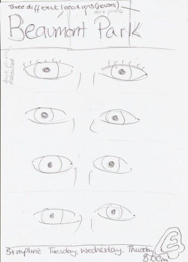
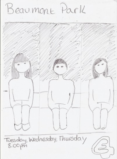
 My second design incorporates the three characters facing the camera but in a very dark location so that their faces are more or less hidden. By using seperate photos I would be able to put the characters in different places but the same position throughout each of the photos. Posed in a location of what could be different bedrooms could show a consistancy between the characters as they are similar in some ways as their pose is the same.
The title is a white statement font on a plain black strapline background across the top. The title would be the same as the title on the trailer so that similarities are made between the two parts of the digipak.
The bottom strapline will be the same styling of the black strapline with the white font text at the bottom, the days on the top line and the time at the bottom underneath. The E4 logo would again be positioned in the same bottom right corner as a prominant part of the poster.

 My third design was a summary of all the characters but having them together as friends in one shot on a bench in a casual environment that is shown in the trailer. Showing the characters facing the opposite way so the characters are still not identified from the trailer. Unlike the other posters I felt this should be in a brighter location in the daytime so the look of the poster is brighter although the characters are darkened looking the  in the opposite direction. 
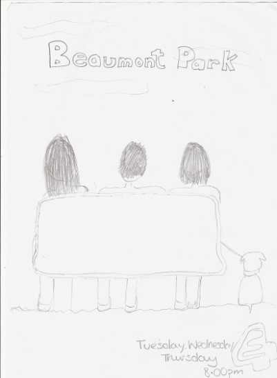
This free website was made using Yola.

No HTML skills required. Build your website in minutes.

Go to www.yola.com and sign up today!

Make a free website with Yola